Presenting Data
Introduction
A picture is said to be worth a thousand words. Tables and graphs, properly designed, can provide clear pictures of patterns contained in many thousands of pieces of information. In this topic, we will describe several ways of displaying information about categorical variables in tabular and graphic form. In later topics, ways of displaying continuous data will be explained.
Frequency Tables
A frequency table (or frequency distribution) displays numbers and percentages for each value of a variable. It is useful for categorical variables (that is, those with values falling into a relatively small number of discrete categories, such as party affiliation, religious affiliation, or region of a country) rather than for continuous variables such as age in years or income in dollars.
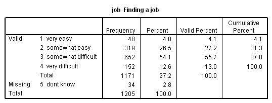
The following frequency distribution shows, from a study of university students, how easy respondents thought it would be to find a job after graduation:
The first column in the table provides a label for each category of the variable. The second and third columns show, respectively, the number and percent of cases in each category for all cases. The fourth column shows the percent in each category after eliminating cases for which we do not have information (missing data). The last column shows the cumulative percentages as one goes from the first to the last category. For example, 26.5% of all respondents, and 27.2% of respondents who answered the question, thought that finding a job would be somewhat easy, while 31.3% thought that it would be at least somewhat easy. (This combines the 4.1% who thought it would be very easy with the 27.2% who thought it would be somewhat easy.) Note that this last column makes sense only if the values of the variable can be meaningfully ranked. In other words, cumulative frequencies assume at least ordinal level measurement. We would not include this column in a frequency distribution for region of the county, for example.
Missing Data
Sometimes information will not be available for some cases for some variables. For example, past voting records will not be available for a newly elected member of congress. Even when information is available, we may wish to treat it as missing data in order to exclude it from our analysis, either because it is irrelevant to our research or because there are too few cases in some categories to permit reliable analysis.
Selecting Cases
In addition to treating data as though they were missing, we may also employ a data filter in order to exclude some cases from our analysis. If, for example, we wished to analyze only Liberals, we might select cases so as to exclude supporters of all the other parties as well as independents.
Recoding Variables
Sometimes it makes sense to recode a variable by combining values into a smaller number of categories.
Seeing an overall pattern can be difficult if a variable contains a large number of categories. For example, if one of the variables in a file of data on the countries of the world is the name of the country, you might want to combine the many countries into a smaller number of regions. Similarly, you might decide to recode age in years into a small number of age categories. You may also decide to recode a variable into a smaller set of categories when the original categories contain too few cases to be reliable.
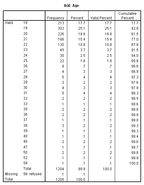
Consider the following frequency distribution for age from the Student Survey:
We might want to create a new variable (call it “agecat”) that would look like the following:

Be careful when combining categories. For one thing, you may be lumping very different things together in a way that will not make any sense. For example, if a political party variable includes a number of minor parties each of which has only a few members you might wish to combine them into a single “other” category. You should first ask yourself whether it really makes sense to combine, for example, Communists, Fascists, and Monarchists. Also, combining categories may result in a lower level of measurement. In the “age” example described in the previous paragraph, combining age in years into age categories may be convenient, but it also reduces a ratio variable to an ordinal variable.
Recoding can also produce misleading results. Suppose, for example, that you are looking at the relationship between age and voting preference, and that for some reason there happened to be big differences between 23 and 24 year olds. The recoding of age described above would cause this difference to be overlooked, since both sets of students would be grouped together in the “23-24” category.
An alternative to combining categories may be to eliminate some from your analysis altogether. This may be necessary when you have too few cases in some categories even when they are combined (or when combining them does not make sense). Regardless of the number of cases available, the decision to exclude some cases may be dictated by your research question. If, for example, you were interested only in analyzing those who planned to voted for a major party candidate in the 2004 presidential election, it might make sense to eliminate all those respondents who voted for someone other than Kerry or Bush. As will be explained shortly, cases can be excluded from analysis either by treating certain values as missing data or by selecting for analysis only those cases meeting certain specified criteria.
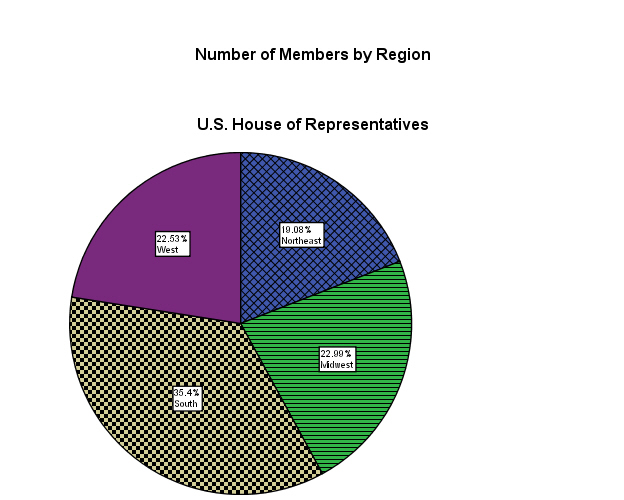
Pie Charts
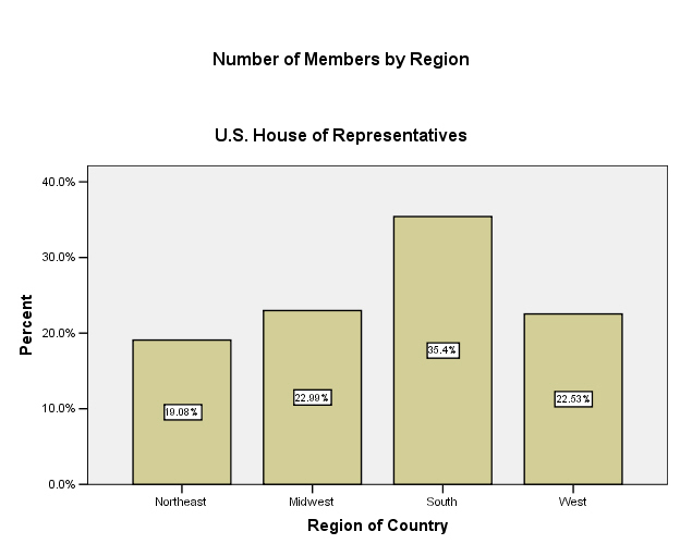
A pie chart is a simple way to show the distribution of a variable that has a relatively small number of values, or categories. This figure, for example, is a pie chart showing the number of seats held in the U.S. House of Representatives by region:
Bar Charts
Another way to portray this kind of information is with a bar chart, as shown in this figure:
A logical place to begin analysis of data is simply to describe the distribution of one variable at a time. (For that reason, such analysis is often referred to as “univariate” analysis.)
Central Tendency
“The “central tendency” of a variable is nothing more than its average value. There are, however, different kinds of averages: the mean, the median, and the mode.
The Mean
Also known as the “arithmetic mean,” this is probably what most of us think of when we use the term average. The mean value of a variable is calculated simply by adding up all the values and then dividing by the number of cases. The mean requires that data be at least interval level. Take, for example, a variable with three cases having the values 2, 3, and 4 respectively. The mean for this variable would obviously be 3 (2+3+4=9; 9/3=3), but this makes no sense unless the difference between 2 and 3 is the same as the difference between 3 and 4.
In mathematical
notation, the mean for population data is represented
by the symbol μ (the lower case Greek letter mu). If we
are using sample data, and the mean (of a variable named X) is represented
by the symbol ![]() (pronounced
“X bar”).
(pronounced
“X bar”).
The Median
The median is calculated by ranking cases from high to low (or vice-versa) and then finding the value of the case that is in the middle (also called the 50th percentile) of the distribution. By definition, half of all cases are at or above the median, and half below[1]. In a distribution of 21 cases, for example, the median value is the value of the 11th highest case, since there are 10 cases with higher values and 10 cases with lower values. If there is an even number of cases, the median value is the value half way between the values of the two cases closest to the middle. For example, in a distribution of 20 cases, the median value is half way between the values of the 10th and 11th highest cases.
The notion of a “middle” case makes sense only if cases can be rank-ordered. Calculation of a median, therefore, requires at least ordinal level data. Sometimes, it makes sense to calculate a median instead of, or in addition to, a mean even with interval or ratio data. If the distribution of the values of a variable is heavily “skewed” by a few very high or very low scores, the mean of the distribution will be misleading. Suppose, for example, that there are 100 households in your neighborhood, and that both their mean and the median incomes are about $40,000 per year[2]. Now suppose that Bill Gates and his family move in next door. The median household income will not change much (it will be the income of the family ranked 51st), but the mean household income will be in the hundreds of millions of dollars. Which figures better describes the “average” family in the neighborhood?
The Mode
The mode of a
variable is the value that occurs most frequently. In
the
Sometimes the
question of which measure of central tendency is used can be a hot political
topic. Many government contracts require contractors to
pay their employees the “prevailing wage.” In federal
law and in most states, the prevailing wage is defined
as the mean. In a couple of states, including
Dispersion
In addition to wanting to know the average value of a variable, we would probably also want some information about how spread out the values are. One measure of this is the range (the difference between the maximum and minimum values), but this provides us with only very limited information. There are some other, more useful, measures.
The Variance and the Standard Deviation
The variance and the standard deviation are related measures of how far away, on average, the values of a variable are from the mean. Since the mean requires at least interval level measurement, so do the variance and the standard deviation.
Consider the two sets of numbers shown below. Both have the same mean (10), but the numbers on the right are clearly more spread out than those on the left.
|
Set 1 |
Set 2 |
|
12 |
14 |
|
11 |
12 |
|
10 |
10 |
|
9 |
8 |
|
8 |
6 |
Table 1 shows how
the variance in the group of numbers on the left is calculated.
In the first column, the individual values of the variable (which we
will represent with the symbol “Xi”) are
listed. In the second column, the “deviation”
from the mean value (µ) of 10 is subtracted from
each value. If we simply took an average of the
deviations, the result would always be zero. Instead, in
the third column we square the deviations from the mean.
Finally we sum (Σ, the upper-case Greek letter sigma) these individual
numbers from the first through the last, or nth (
![]() ),
and divide by the number of cases (5). The result is the
“mean squared deviation from the mean,” or the variance.
For population data, the variance[4]
is represented by the symbol
),
and divide by the number of cases (5). The result is the
“mean squared deviation from the mean,” or the variance.
For population data, the variance[4]
is represented by the symbol ![]() 2
(the square of the lower-case Greek letter sigma) for population data, and s2
for sample data.
2
(the square of the lower-case Greek letter sigma) for population data, and s2
for sample data.
|
Table1: Calculating Variance |
||
|
Xi |
Xi – µ |
(Xi - µ)2 |
|
12 |
2 |
4 |
|
11 |
1 |
1 |
|
10 |
0 |
0 |
|
9 |
-1 |
1 |
|
8 |
-2 |
4 |
|
|
||
The standard
deviation (![]() for population data, s for sample data), like the variance, is a measure of
dispersion, and is the one usually reported. It is
simply the positive square root of the variance. In the
above example,
for population data, s for sample data), like the variance, is a measure of
dispersion, and is the one usually reported. It is
simply the positive square root of the variance. In the
above example,
The variance and the standard deviation are usually not of great interest in and of themselves. They are, however, central to a wide variety other statistical methods. Occasionally, they do have direct application. Beck, for example, demonstrates the nationalization of American politics by showing that the standard deviation in presidential vote by state declined fairly steadily between 1896 and 1992[5].
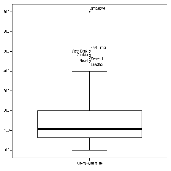
Boxplots
A boxplot (also
known as a “box and whiskers” plot) is another way of examining the
distribution of a continuous variable. This figure
(using data from the CIA World Factbook –
|
The “box” in the figure shows the “interquartile range.” That is, the line at the top of the box represents the value of the 75th percentile, while the line at the bottom of the box represents the value of the 25th percentile. In other words, the middle half of all counties are within the box. The value of the 50th percentile (that is, of the median value) is represented by the horizontal line within the box. The lines extending from the box are the “whiskers,” and the horizontal lines at the end of the whiskers represent the highest and lowest values that are outside the box but within 1.5 times the inter-quartile range (1.5*IQR). The circles beyond the whiskers represent “outliers,” that is, cases outside the box by more than 1.5*IQR, while asterisks represent “extreme” values, that is, those outside the box by more than 3*IQR. The figure shows that the distribution of unemployment is positively “skewed”: there is a bigger difference between the 75th and 50th percentile than between the 50th and 25th percentiles, the upper whisker is longer than the lower one, and all outliers and extreme values are at the top of the plot, indicating countires with very high rates of unemployment.
Exercises
Note: There are several ways to produce the statistics and graphs described in this topic. The frequencies procedure can produce all of the statistics described; the descriptives procedure can produce all but the median and the mode; the explore procedure can produce all but the mode, and also produces boxplots. There is also a separate and more powerful procedure specifically for generating boxplots.
1. Calculate variance and standard deviation for the second set of numbers listed above.
2.
A number of years ago, Scammon and Wattenberg famously described the
average American voter as “A 47 year-old housewife
from the outskirts of
3. Using Webstats, pick one of the datasets and locating the interval and ratio level variables in this dataset, use frequencies to calculate and compare the means and the medians. For which variables are they markedly different? Speculate as to why.
4. Using Webstats open the Canadian National Election Study. You will find “feeling thermometers” in which respondents were asked to indicate how “warmly” they felt about various political figures. On these thermometers, which range from 0 to 100, the higher the score, the more “favorable and warm” the respondent reported feeling about the person in question. Toward which political figures did respondents have the warmest feelings? Where there are both pre and post election thermometers for the same person, were these people perceived more favorably after the election than they had been before?
Some political leaders are very polarizing figures, toward whom many people have either very warm or very cool feelings. Others provoke more lukewarm responses. Presumably, the more polarizing figures would have higher standard deviations in their thermometers. Compare the different leaders in this regard. Where available, compare their thermometers in the pre-election survey versus the post-election survey to test the notion that the campaign may have caused peoples reactions to become more divided.
For Further Study
Lane, David M., “Chapter 2: Describing Univariate Data,” Hyperstat Online. http://davidmlane.com/hyperstat/
Lowry, Richard, “Chapter 2: Distributions,” Concepts and Applications of Inferential Statistics. http://faculty.vassar.edu/lowry/webtext.html.
[1]
Except in Garrison Keillor’s
[2]
In 2000, the median household income in
the
[3]
Debra J. Saunders, “Reason to Rally ‘Round the Flag,” San
Francisco Chronicle,
[4]
The formula for the population variance is .
.
![]() For
samples, the formula is adjusted by subtracting 1
from the denominator.
For
samples, the formula is adjusted by subtracting 1
from the denominator.
[5] Paul Allen Beck, Party Politics in America, 8th edition (N.Y.: Longman, 1997), 55-56.
[6] Richard M. Scammon and Ben J. Wattenberg, The Real Majority (N.Y.: Coward-McCann, 1970), 70 (emphases added).