| Subtopics |
|
Introduction
Tables can provide clear pictures of patterns contained in many thousands of pieces of information. In this topic, we will describe several ways of displaying information about categorical variables. In later topics, ways of displaying continuous data will be explained.
Contingency Tables
Contingency tables (also called crosstabulations, or “crosstabs” for short) display the relationship between one categorical (usually nominal or ordinal) variable and another. They are called “contingency tables” because they allow us to examine a hypothesis that the values of one variable are contingent (dependent) upon those of another.
The following crosstabulation shows the relationship, also from the study of American college students, between voting intention in the 2004 presidential election and whether the student was attending a public or a private college or university.
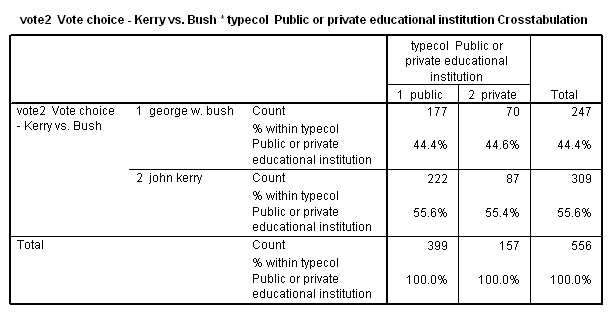
There are several important things to notice about the way in which the table has been set up:
- The table consists of a matrix of rows and columns. Since there are two rows and two columns, it would be referred to as a “two by two” table. A table with four rows and three columns would be referred to as a “four by three” table. (Note that the number of rows is always given first.) The values of one of the variables are placed in the rows and those of the other in the columns. Usually, as in this case, the dependent variable is the row variable and the independent variable is the column variable. There is, however, no requirement that this be the case. If it fits the available space better to put the dependent variable in the columns, go ahead and do so.
- The number of cases in each cell of the table has been converted to a percent. Notice that in this example there are a lot more students enrolled in public than in private institutions. By converting numbers of cases to percents, we facilitate making comparisons among all three ideological groups, since each group, despite their different sizes, totals to the same 100%.
- In this case, we have percentaged down the columns rather than across the rows. Always percentage in the direction of the independent variable. This is necessary because we are testing the hypothesis that different categories of the independent variable will tend to have different values for the dependent variable. In this case, we hypothesize that people with different ideologies will vote differently.
- The table includes information on the number of cases (N) on which the percentages are based. This gives us a rough idea of the reliability of the percentages [1] . If there were only a few cases in one of the categories, we would view the findings for this category with skepticism.
Do not let all the trees get in the way of seeing the forest. In interpreting a crosstab, it is crucial to look for the overall pattern. In this case, the table shows that there is virtually no relationship between the type of institution students attend and their voting intentions. While this is fairly obvious in this case, in viewing a larger table one may become distracted by the details. Look first for the overall pattern, and don’t allow yourself to get bogged down in the pursuit of trivia.
Making Tables Presentable
The crosstab table presented above just as they were generated by SPSS. For use in your presentation at the end of the term, however, you will probably want tables that are more aesthetically pleasing. The following tables are a little more presentable, and also contain a bit more information, including 1) a title that briefly describes what the table is about, and 2) the source of the data used to generate the table. While you should do likewise for your presentation at the end of term, it will be sufficient to copy and paste tables from SPSS into your word processor for routine homework assignments.
| Table 1: Perception of Ease of Finding a Job After Graduation | ||||
|
N |
Percent |
Valid Percent |
Cumulative Percent |
|
| Very easy |
48 |
4.0 |
4.1 |
4.1 |
| Somewhat easy |
319 |
26.5 |
27.2 |
31.3 |
| Somewhat difficult |
652 |
54.1 |
55.7 |
87.0 |
| Very difficult |
152 |
12.8 |
13.0 |
100.0 |
| Subtotal |
1171 |
97.2 |
100.0 |
|
| Don’t Know |
34 |
2.8 |
|
|
| Total |
1205 |
100.0 |
|
|
| Source: Harvard University Institute of Politics, Study of “The Political Personality of America’s College Students,” 2004 | ||||
|
|
||
|
|
Public |
Private |
|
Vote Intention |
|
|
|
Bush |
44.4% |
44.6% |
|
Kerry |
55.6 |
55.4 |
|
|
|
|
|
Total |
100.0% |
100.0% |
|
N |
399 |
157 |
|
|
|
|
|
Source: Harvard University Institute of Politics, Study of “The Political Personality of America’s College Students,” 2004 |
||
Clustered bar charts are a useful way to provide a graphic display similar to the tabular display in a crosstab. The chart shown here is equivalent to the contingency table described above.
